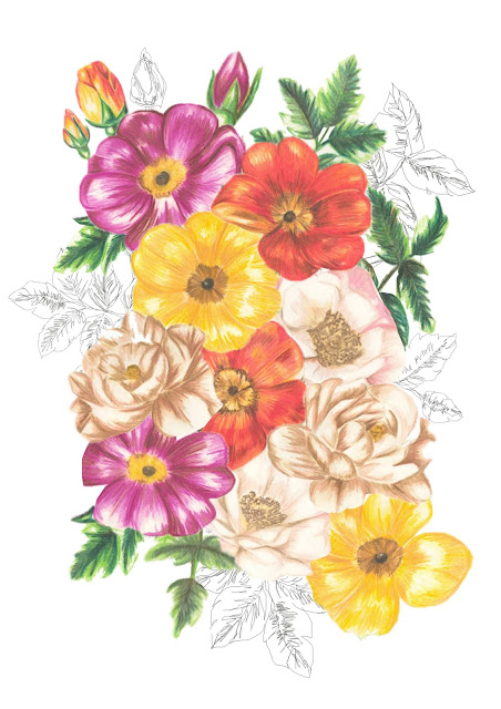
For my professional studies module I am required to create and print business cards that reflect my designs and chosen career path. As a surface designer I really want my business cards to show off my illustrations but also look really professional and memorable - so people can look at the card and remember my work and what I do instantly. To do this I think some form of illustration on the card will be of massive importance as it needs to be really eye catching and memorable. I think the font I use for my name and what I do is also really important, as it needs to stand out, I also want my chosen font to be memorable to my brand of design, so it needs to be the same on my blog, social media, website, etc.
My first attempt ...
At first I was really happy with this first draft but now I think there is way too much going on text wise and not enough illustration, instead of trying to squeeze every form of contact/social media on one side with such large font I think I should make us of the back of the card and provide the information of how to contact me and where on there. I quite like the negative space in this draft and I think it flows well but there is simply too much font and not enough illustration. Although I feel I've varied my drawings I still don't think there is enough colour in this draft. Also I don't really think its clear from this card what I actually do, so this also needs to change.
My second attempt...
I really like how clean this second attempt looks and I think it showcases my drawing abilities reasonably well. I do, however, think the repeat I've used looks far too 'blocky' and needs to flow better, I also think that just featuring only one illustration could be limiting in the design too, as I need to really showcase as many illustrations that I can do at once without it looking too crowded. The colours used in this draft are also very limiting and it isn't as exciting or vibrant as I want my business card to look, in all of my final collection there is a lot of bright colour so if someone likes the look of this business card the finished work I actually produce will be a lot different and they may be disappointed.
My third attempt ...
I love the colours that are in this attempt, but I think the illustrations are too cropped and not fully showing off all of my drawing potential, although some of the detail in the florals has come out really clear I don't think its enough to use as a potential card for my business. The negative space in this draft looks really interesting and I think its quite successful, but the drawings are just too cropped for this design to be my final design that I get printed.
My fourth attempt ...
Again I love the colours in this design, I think they look really vibrant and exciting, which is really what I'm looking for in my business cards. I do think that perhaps this design is too crowded and that I need to space the illustrations out a bit more but I'm still undecided as I think I quite like how its looking at the moment although I seem to be changing my mind frequently.
I really like the font I've been using in these drafts and see it as my 'signature' style, so although I'm open to changing it I feel like every font in my name should be the same if that makes sense? What do you all think?
Please feel free to leave any comments
Evie
xx


